Difference between revisions of "Scenario Quality Ranking"
(DoZ4GP <a href="http://ebogsldcvjjq.com/">ebogsldcvjjq</a>, [url=http://japdksaqxsgb.com/]japdksaqxsgb[/url], [link=http://bzhnjbpppmrn.com/]bzhnjbpppmrn[/link], http://gryphofkvnhw.com/) |
|||
| Line 144: | Line 144: | ||
= | DoZ4GP <a href="http://ebogsldcvjjq.com/">ebogsldcvjjq</a>, [url=http://japdksaqxsgb.com/]japdksaqxsgb[/url], [link=http://bzhnjbpppmrn.com/]bzhnjbpppmrn[/link], http://gryphofkvnhw.com/ | ||
[http:// | |||
Revision as of 23:17, 7 March 2010
Group 1
<Rank High>
Internet Commerce:
free internet service provision 2003 (1996)
Good contents: Clear explanation in Trend and Matrix makes Scenario convincing.
Good presentation: Easy to follow, nice visual impression
<Rank Middle> Health: health in 2010 (1996)
OK contents: Interesting contents, but relationship between driving forces and scenarios is vague.
OK presentation: Easy to follow, but not so well visual impression
<Rank Middle>
Work and Organizations:
Organizations 2020 (1997)
OK contenst: The story is credible, but sometimes too complex and little techonoly implications
OK presentation: The prentation is easy to follow, could include some visuals
<Rank Low>
Industry sectors:
Leisure 2010 (1999)
OK contenst: The story is credible, but future can be a mixure of all scenarios
Not good presentation: Not easy to follow, not clear sequence of the project
<Rank Low>
Telecommunications:
telcoms 2003 (1996)
Not good contents: Overall story is not convincing. The axis for scenarios seems unreflected.
OK presentation: Easy to follow, but not so well visual impression
Group 2
BEST
Human Relationships in 2015
- Reasons: Original, easy to understand, linkage between elements
Telecommunications in 2015
- Reasons: Well-researched, detailed, in places uncany in predicting future. Signposts were good. Crowded waters scenario especially strong.
Leisure in 2010
- Reasons: Well researched, organized and presented.
Distance Education in 2010
- Reasons: Easy to read, nice framework, it goes to the point
Branding in 2005
- Reasons: easy to understand, takes into account not only marketing concepts
Workspace in 2010
- Reasons: some parts were really good, but others not. Overall, it doesn't look like an integrated document/proposal. No conclusions.
Food Retailing in 2006
- Reasons: Focused on Alberthein in Netherlands too narrow, Difficult to read, Not very revolutionary ideas
Electronic Cash in 2010
- Reasons: Disorganized and not so clearly presented, there is no clear explanation how electronic cash can affect society.
Telecommunications in 2003
- Reasons: Not well thought out. Unclear. Basic assumptions left unstated. Research was very poor. Scenarios not believable--actors did things that were illogical given the scenario laid out.
Internet in 2005
- Reasons: Unoriginal, not forward looking enough, no linkage between elements, badly organized
Group 3
Dear scenario-thinkers,
please explore our way of thinking and our results!
Short introduction to our evaluation process:
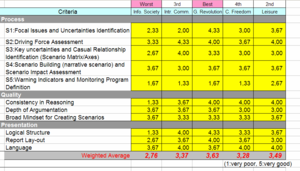
- Developing criteria catalogue for assessing scenarios: five process, three quality, three presentation criteria
- Screening all scenarios
- Chose 5 most recent ones (4 group scenarios, 1 class scenario) to analyze in depth
- Everyone of group individually assessed these 5 scenarios according to the criteria catalogue (reasoning: everyone has same starting point for discussion, increase common understanding, learning experience of group larger)
- Merging the individual results and discussing the final ranking
Criteria catalogue for assessing scenarios:
- Process, quality and presentation (effectiveness, efficiency and presentation)
- Weighting 40% - 40% - 20% to emphasize content over lay-out
- Please also refer to the attached picture
Ranking results
Rank 1: Genetic revolution
- Process: Introduction is present, good/deep structured assessment of driving forces, indicators and monitoring process missing
- Quality: very consistent in approach, detailed argumentation
- Presentation: good structure and creative presentation of the scenarios
Rank 2: Leisure
- Process: reflected on indicators and implications, chosen matrix easy to understand, causal relationship scheme missing
- Quality: no referencing present, consistent in approach, broad mindset
- Presentation: no logical structure, not attractive/boring coloring
Rank 3: Interpersonal communication
- Process: no focal issues, good causal scheme but no interpretation, indicators and monitoring process missing
- Quality: missing depth in scenarios, consistent however
- Presentation: well structured, nice layout but cold be more entertaining, no consistency in the language
Rank 4: Childhood Freedom
- Process: bad introduction, missing steps, over structured in depth of driving forces (image as a whole not present, confusing), choice of axes mysterious
- Quality: reasoning and in-depth analysis lacking, consistency good, good wrapping of ideas
- Presentation: original, logistics are hidden
Rank 5: Information Society (Class project)
- Process: no introduction, no focal issues, no reasoning behind thinking, no transparency, no causality
- Quality: no consistency, no sufficient depth of argumentation
- Presentation: no structure, no consistency in lay-out
Lessons learned and take-away from this exercise
- follow the right procedures and steps
- ensure clear links between the steps
- warning indicators + monitoring process have to be present
- transparency in reasoning
- goal: balance between structure & creativity
- balance between conciseness (focus/summary) and depth (and NOT volume)
- Define structure of presentation beforehand
- Properly select colors and layout for readability and usability
- The class presentation was the worst one due to lack of consistency and structure. It is therefore very important for the whole class that we have coordinating role to ensure a successful project
DoZ4GP <a href="http://ebogsldcvjjq.com/">ebogsldcvjjq</a>, [url=http://japdksaqxsgb.com/]japdksaqxsgb[/url], [link=http://bzhnjbpppmrn.com/]bzhnjbpppmrn[/link], http://gryphofkvnhw.com/
